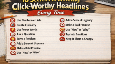

Table of Contents
A high-performing Landing Page plays a critical role in the success of any digital marketing strategy. It serves as the point where traffic, messaging, and user intent converge, making it one of the most valuable tools for turning visitors into leads or customers. Whether your objective is lead generation, product sales, webinar registrations, or email sign-ups, the effectiveness of your Landing Page directly impacts overall campaign performance.
However, generating traffic alone does not guarantee results. Even the most well-funded advertising campaigns can fail if the Landing Page is not optimized for conversions. Conversion optimization focuses on guiding visitors toward a specific action by removing friction, clarifying value, and enhancing user experience. Every element on a Landing Page—from headlines and visuals to forms and calls-to-action—should be intentionally designed to influence behavior and encourage engagement.
A strategically built Landing Page combines clear messaging, intuitive layout, fast loading speed, and persuasive design principles. It addresses user pain points, reinforces trust, and delivers a seamless journey from arrival to conversion. When these elements work together, visitors are far more likely to stay, interact, and complete the desired action instead of leaving without converting.
To achieve measurable results and maximize return on investment, marketers must go beyond surface-level design and adopt proven conversion optimization practices. The following nine strategies are designed to help you strengthen your Landing Page performance, increase engagement, and consistently turn visitors into valuable business outcomes.
1. Craft a Clear and Compelling Headline
The headline is the most critical element of any Landing Page because it determines whether visitors stay or leave within the first few seconds. When users arrive on a Landing Page, they scan before they read, and the headline is the first message that shapes their perception of value. A strong headline immediately communicates what the offer is, who it is for, and why it matters—without forcing the visitor to think or search for answers.
An effective Landing Page headline focuses on benefits rather than features. Instead of describing what you do, it should clearly explain how the visitor’s problem will be solved or how their situation will improve. Clarity always outperforms creativity in headline writing. If users cannot instantly understand the value of your Landing Page, they are far more likely to abandon it, no matter how good the rest of the content may be.
Alignment is equally important. The headline on your Landing Page should closely match the message used in your ads, email campaigns, or search results. This consistency reassures visitors that they have landed in the right place and builds immediate trust. When expectations set before the click are met after the click, engagement and conversion rates increase significantly.
Supporting subheadlines can further strengthen your Landing Page by adding context, emphasizing key benefits, or addressing common objections. Together, the headline and subheadline should work as a persuasive hook—capturing attention, reinforcing relevance, and motivating users to continue exploring the page.
In short, a clear and compelling headline sets the foundation for Landing Page success. It grabs attention, establishes value, aligns with user intent, and prepares visitors to take the next step toward conversion.
2. Align Messaging with User Intent
One of the most common reasons Landing Pages fail to convert is a disconnect between visitor expectations and the page content. Users arrive with a specific need, question, or problem in mind, often driven by an advertisement, search result, or email link. If your Landing Page fails to immediately address that intent, visitors may leave within seconds, regardless of how visually appealing or well-designed the page is.
Aligning messaging with user intent means ensuring that every element on your Landing Page reflects the promise made before the click. Headlines, subheadlines, images, and body text should consistently communicate the same offer or value proposition presented in your ad or marketing message. This consistency reassures visitors that they are in the right place, fostering trust and making them more likely to engage with your content or complete the desired action.
Beyond alignment, your messaging should anticipate visitor questions and objections. What does your audience hope to gain from your offer? What doubts might they have before converting? By addressing these points directly on your Landing Page, you create a sense of clarity and transparency that encourages users to move forward with confidence. This might include highlighting benefits, providing testimonials, or explaining unique features that differentiate your solution from competitors.
Furthermore, personalization can enhance message alignment. Tailoring your Landing Page to specific audience segments or traffic sources ensures the content resonates deeply with each visitor. For example, users coming from a product demo ad may respond better to case studies and feature highlights, while those arriving from a blog post may be more interested in educational content or guides.
In essence, aligning your Landing Page messaging with user intent is about creating a seamless, relevant experience from first click to conversion. When visitors immediately recognize that the page addresses their needs, their engagement, trust, and likelihood to convert increase dramatically, forming the foundation for higher-performing Landing Pages.
3. Optimize Your Call-to-Action (CTA)
The call-to-action (CTA) is the centerpiece of any Landing Page—it’s the point where a visitor decides whether to take action or leave. Even if your Landing Page has a compelling headline, persuasive copy, and visually appealing design, a weak or unclear CTA can prevent conversions. Optimizing the CTA is therefore essential to ensure that visitors understand exactly what you want them to do and feel motivated to act.
A strong CTA begins with clear, action-oriented language. Instead of vague phrases like “Submit” or “Click Here,” use verbs that convey immediate value or benefit, such as “Get Your Free Guide,” “Start My Trial,” or “Reserve My Spot.” The language should communicate both the action and the reward, giving visitors a compelling reason to click.
Placement and visibility are equally important. Your CTA should be prominent on the page, ideally above the fold, so users do not have to scroll to find it. For longer Landing Pages, consider including multiple CTAs strategically placed after key sections of content, ensuring that a visitor is never far from taking the next step. Visual contrast is crucial—buttons should stand out through color, size, and whitespace, drawing the eye naturally to the action you want the user to take.
Testing different CTA variations is a proven strategy for increasing conversions. A/B testing can help you identify the most effective combinations of text, color, size, and placement. Even small tweaks, such as changing a word or button color, can result in significant improvements in click-through rates and conversions.
Finally, ensure your CTA reduces friction. Use clear instructions, minimize distractions around the button, and avoid requiring unnecessary steps. Every additional field, link, or confusing element can reduce the likelihood of a visitor taking action.
In summary, the CTA is the bridge between visitor interest and conversion. A well-optimized CTA not only tells visitors what to do but motivates them to act, guiding them smoothly through the Landing Page experience and maximizing your conversion potential.
Read more : 12 Advanced CTR Optimization Methods to Increase Your Clicks
4. Simplify the Design and Layout
The design and layout of your Landing Page play a critical role in guiding visitors toward conversion. Even the most compelling copy or offer can fail if the page feels cluttered, confusing, or overwhelming. A clean, well-organized Landing Page ensures that users can quickly understand the value of your offer and take the desired action without distraction.
Simplicity starts with visual hierarchy. Important elements, such as headlines, CTAs, and key benefits, should stand out immediately, while secondary information is positioned to support—but not compete with—the primary message. Use clear headings, concise text, and strategic spacing to make it easy for visitors to scan and comprehend your Landing Page quickly.
White space, often underestimated, is a powerful tool. Adequate spacing around text, images, and buttons not only improves readability but also draws attention to the elements that matter most. A crowded Landing Page can overwhelm visitors, creating friction and reducing the likelihood of conversion. White space guides the eye naturally, allowing users to focus on the content and actions that lead to results.
Navigation should also be minimal. Traditional website menus can distract users from the main goal of a Landing Page. Consider removing unnecessary links or simplifying navigation options so that visitors are focused on completing the conversion action rather than exploring other pages. Every element on the page should serve a clear purpose in supporting your primary objective.
Additionally, images and visuals should enhance, not overwhelm, the message. High-quality graphics, icons, and product images can clarify value propositions, demonstrate benefits, and create an emotional connection with visitors. Avoid decorative visuals that do not support the conversion goal, as they can dilute focus and slow down page performance.
Finally, consistency in colors, fonts, and design elements reinforces brand trust and makes the Landing Page feel professional and cohesive. A well-structured, visually appealing page communicates credibility and encourages users to stay and engage.
In essence, simplifying the design and layout of your Landing Page removes barriers to action, highlights the key value of your offer, and creates a seamless experience that guides visitors naturally toward conversion. A clean, intuitive page is not just aesthetically pleasing—it’s a strategic tool for boosting results.
5. Improve Page Load Speed
Page load speed is one of the most critical factors affecting the performance of your Landing Page. Visitors expect web pages to load almost instantly, and even a delay of a few seconds can lead to higher bounce rates, lost conversions, and a negative perception of your brand. A fast-loading Landing Page ensures that users can access your content quickly, engage with your offer, and complete the desired action without frustration.
Several factors can impact the loading speed of your Landing Page. Large, unoptimized images are a common culprit. Compressing images, using the appropriate file formats, and leveraging responsive design can significantly reduce load times without compromising visual quality. Similarly, minimizing the use of heavy scripts, unnecessary plugins, or excessive animations helps streamline page performance. HubSpot
Web hosting and server performance also play a key role. Investing in a reliable, high-speed hosting solution ensures that your Landing Page loads consistently well, even during periods of high traffic. Using content delivery networks (CDNs) can further improve speed by delivering your content from servers located closer to your visitors.
Mobile optimization is closely tied to speed. Many visitors access Landing Pages via smartphones or tablets, where slow-loading pages are particularly frustrating. Ensuring that your page is lightweight, mobile-responsive, and optimized for smaller screens improves both load speed and user experience.
Page speed also affects search engine rankings. Google considers load time as a ranking factor, meaning a slow Landing Page can hurt organic visibility and reduce the volume of qualified traffic arriving at your page. By improving speed, you not only enhance user experience but also strengthen your overall digital marketing performance.
In conclusion, optimizing page load speed is essential for any high-performing Landing Page. A fast, responsive page keeps visitors engaged, reduces bounce rates, improves search visibility, and directly contributes to higher conversion rates. Investing in speed is an investment in both user satisfaction and the success of your marketing campaigns.
6. Use Trust Signals and Social Proof
Building trust is essential for converting visitors on a Landing Page, especially when they are making decisions that involve personal information, financial commitment, or a significant investment of time. Trust signals and social proof provide reassurance, credibility, and confidence, encouraging users to engage with your offer and complete the desired action.
Trust signals come in many forms, including security badges, certifications, privacy guarantees, and clear contact information. Displaying these elements on your Landing Page communicates that your brand is professional, reliable, and committed to protecting user data. For example, showing SSL certificates or secure payment logos reassures visitors that their information is safe, which reduces friction in the conversion process.
Social proof, on the other hand, leverages the experiences and opinions of others to influence decision-making. Testimonials, reviews, client logos, case studies, and user-generated content can significantly enhance credibility. Visitors are more likely to trust the judgments of peers or respected brands than your own promotional claims. Including detailed testimonials with names, photos, and specific results makes social proof even more persuasive and relatable on your Landing Page.
Additionally, statistics, awards, and media mentions can amplify trust and showcase authority. Highlighting metrics like “Over 10,000 satisfied customers” or “Featured in [Trusted Media Outlet]” provides quantifiable evidence that your offer is valuable and widely recognized.
Placement and presentation matter. Trust signals and social proof should be visible without overwhelming the visitor. Position them near key decision points, such as around the CTA or within the main content, so they reinforce confidence at critical moments.
In summary, integrating trust signals and social proof on your Landing Page reduces uncertainty, builds credibility, and encourages visitors to take action. By demonstrating reliability, authority, and social validation, your Landing Page becomes a more convincing and high-performing conversion tool.
Read more :10 Steps From Chaos to Growth: Build a Crisis-Proof Strategy
7. Optimize Forms for Ease of Use
Forms are often the final step in the conversion process on a Landing Page, making their design and usability critical to overall performance. Even if your headline, copy, and visuals are compelling, a complicated or confusing form can prevent visitors from completing the desired action. Optimizing forms ensures that users can provide their information quickly, efficiently, and without frustration.
The first principle of form optimization is simplicity. Ask for only the information that is absolutely necessary for the conversion. Long forms with multiple fields can intimidate visitors and increase drop-off rates. For example, requesting just a name and email for a newsletter sign-up is more effective than asking for phone numbers, addresses, or additional personal details. The simpler the form, the lower the barrier to action.
Clear labeling and instructions are equally important. Each field should have descriptive labels, and any potential confusion—such as formatting requirements for phone numbers or passwords—should be addressed with concise guidance. Inline validation, which provides immediate feedback when a user fills out a field incorrectly, can prevent errors and reduce frustration, keeping the user engaged until completion.
The design and placement of the form also impact conversion rates. Forms should be visually distinct, easy to find, and logically positioned near the CTA. Use whitespace strategically to make the form stand out and avoid clutter that could distract the visitor. Buttons should be large, clearly labeled, and visually prominent, reinforcing the action you want users to take.
Finally, consider adding trust elements near the form, such as privacy assurances, security badges, or a note about how user data will be handled. These reassurances reduce anxiety and increase the likelihood that visitors will submit their information.
In short, optimizing forms on your Landing Page is about reducing friction, improving usability, and instilling confidence. A well-designed, user-friendly form ensures that interested visitors can complete the conversion process effortlessly, turning potential leads into tangible results.
8. Make Your Landing Page Mobile-Friendly
In today’s digital landscape, a significant portion of web traffic comes from mobile devices. Smartphones and tablets account for a majority of internet usage, meaning your Landing Page must provide a seamless experience across all screen sizes. A mobile-friendly Landing Page ensures that visitors can access your content, engage with your offer, and convert without frustration, regardless of the device they are using.
Mobile optimization starts with responsive design. Your Landing Page should automatically adjust layouts, images, and text to fit the screen size, maintaining readability and usability. Text should be large enough to read comfortably without zooming, buttons should be easy to tap, and forms should be simplified for smaller screens. Even small misalignments or unreadable text can create friction and increase bounce rates.
Load speed is particularly important on mobile devices, where connection speeds can vary. A fast, lightweight Landing Page reduces the risk of users abandoning the page due to slow loading times. Optimizing images, minimizing scripts, and leveraging mobile-friendly frameworks are key strategies for maintaining performance. Unbounce
Navigation and interaction also need to be mobile-friendly. Remove unnecessary menus or complex dropdowns that can be difficult to use on touch screens. Place key CTAs within easy reach, ideally above the fold, so users can act without excessive scrolling. Mobile visitors should have the same clear path to conversion as desktop users, but with a streamlined, touch-optimized interface.
Testing your Landing Page on multiple devices and screen sizes is essential. What works on desktop may not translate effectively to mobile. Regular testing helps identify usability issues, ensuring that buttons, forms, and interactive elements function properly for every visitor.
In summary, making your Landing Page mobile-friendly is no longer optional—it is a necessity. A responsive, fast, and intuitive mobile experience keeps visitors engaged, builds trust, and maximizes conversions across all devices, ensuring your Landing Page performs at its best in today’s multi-device world.
9. Continuously A/B Test and Analyze
Even the most carefully designed Landing Page can benefit from ongoing optimization. Conversion optimization is not a one-time effort—it’s an iterative process that requires testing, analysis, and refinement. A/B testing, also known as split testing, allows you to compare different versions of your Landing Page to determine which elements drive higher engagement and conversions.
A/B testing can involve headlines, CTAs, images, layouts, forms, colors, and even the placement of content. For example, testing two variations of a CTA button—one with “Get My Free Guide” and another with “Download Now”—can reveal which wording resonates more with your audience. Similarly, changing the position of a form or headline might significantly impact user behavior. Small adjustments often lead to measurable improvements in conversion rates.
Data analysis is equally critical. Track key metrics such as bounce rate, time on page, click-through rate, and form submissions to identify areas of improvement. Tools like heatmaps, session recordings, and analytics platforms provide valuable insights into how users interact with your Landing Page. Understanding visitor behavior allows you to make informed decisions rather than relying on guesswork.
Testing should be continuous, not sporadic. Market trends, user preferences, and behavior patterns change over time, and what converts well today may underperform tomorrow. By adopting a culture of ongoing experimentation, you ensure that your Landing Page evolves to meet audience expectations and maintains high performance. WordStream
Additionally, segmenting tests by traffic source, audience type, or device can provide deeper insights. For example, mobile visitors may respond differently to a CTA than desktop users, or leads from social media may engage with content differently than those from email campaigns. Tailoring optimizations based on these insights further enhances effectiveness.
In summary, continuous A/B testing and analysis are essential for maintaining and improving the performance of your Landing Page. By systematically experimenting, measuring results, and iterating, you create a data-driven approach to conversion optimization that maximizes engagement, builds trust, and drives consistent, measurable results.
Conclusion
Optimizing your Landing Page is essential for turning traffic into tangible business results. Every element—from headlines and CTAs to forms, visuals, and page speed—plays a critical role in guiding visitors toward conversion. By focusing on clarity, user intent, trust, mobile-friendliness, and continuous testing, you create a Landing Page that not only attracts attention but also drives meaningful action.
Conversion optimization is an ongoing process, not a one-time task. Regularly analyzing performance, experimenting with A/B tests, and refining content ensures that your Landing Page evolves alongside changing user behavior and market trends. When these strategies are applied consistently, your Landing Page becomes a powerful tool for increasing engagement, building trust, and maximizing ROI.
In short, a strategically designed and continuously optimized Landing Page transforms casual visitors into loyal customers, helping your business achieve sustainable growth and measurable success.