

Table of Contents
A high bounce rate is rarely a coincidence. In most cases, it is a clear signal that something within the user experience is broken or misaligned with user expectations. Visitors don’t abandon websites without reason — they leave because the experience feels confusing, slow, overwhelming, or frustrating from the very first interaction. These moments of friction, even when subtle, quickly erode trust and patience.
Very often, UX Design Errors are the invisible forces driving this behavior. They quietly undermine engagement, interrupt user journeys, and prevent visitors from taking meaningful action. Poor navigation, unclear layouts, slow performance, or intrusive elements may seem minor on their own, but together they create an experience that pushes users away instead of pulling them in. Over time, these UX Design Errors translate into lost conversions, reduced session durations, and missed growth opportunities.
No matter the type of website — whether it’s an e-commerce store competing for attention, a SaaS platform trying to demonstrate value, or a corporate website aiming to build credibility — user experience plays a decisive role in retention and performance. When UX Design Errors are left unaddressed, even high-quality content or strong marketing efforts fail to deliver results. Users expect clarity, speed, and intuitive interactions, and they will not hesitate to leave if those expectations are not met.
Understanding and correcting UX Design Errors is therefore not just a design concern, but a strategic necessity. By identifying the elements that create friction and optimizing how users interact with your site, you can significantly improve engagement, reduce bounce rates, and guide visitors toward conversion.
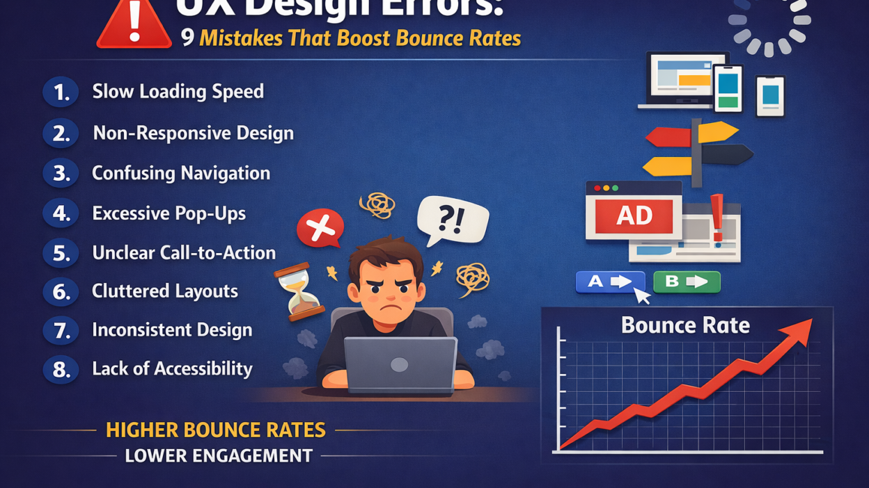
Below, we explore the nine most common UX Design Errors that increase bounce rates, along with practical insights on how to fix them and create a smoother, more satisfying user experience.
1. Slow Page Load Speed
Slow page load speed is one of the most damaging and underestimated UX Design Errors affecting modern websites. In a digital environment where users expect instant access to information, even a delay of a few seconds can be enough to trigger frustration and abandonment. When a page takes too long to load, users don’t wait to understand why — they simply leave.arxiv
From a user’s perspective, speed is part of the experience. A slow-loading website immediately creates the impression that the platform is outdated, unreliable, or poorly maintained. This perception damages trust before the content even appears. As a result, slow performance becomes a critical UX Design Error that directly contributes to high bounce rates and low engagement.
This issue is especially harmful on mobile devices, where users often rely on unstable connections or limited bandwidth. Heavy images, unoptimized scripts, excessive animations, and poorly structured code compound the problem. When mobile users encounter slow loading times, the likelihood of an immediate exit increases dramatically, making this one of the most costly UX Design Errors for businesses targeting mobile traffic.webless
Beyond user behavior, page speed also affects visibility. Search engines consider performance as a ranking factor, meaning slow websites not only lose users but also struggle to attract them in the first place. This creates a double penalty: fewer visitors arriving and more visitors leaving quickly due to poor experience — all driven by avoidable UX Design Errors.
To fix this issue, performance optimization must be treated as a core UX priority, not a technical afterthought. Compressing and properly sizing images, minimizing CSS and JavaScript files, reducing unnecessary plugins, enabling browser caching, and using a reliable hosting infrastructure can dramatically improve load times. Regular performance testing is also essential to identify bottlenecks before they impact users..cpluz
Eliminating slow page load speed as a UX Design Error creates an immediate positive effect. Faster pages feel smoother, more professional, and more trustworthy, encouraging users to stay longer, explore deeper, and engage with your content instead of leaving within seconds.
2. Poor Mobile Responsiveness
Poor mobile responsiveness is one of the most critical UX Design Errors in today’s digital landscape. With the majority of users accessing websites through smartphones and tablets, a design that performs well only on desktop is no longer acceptable. When a site fails to adapt smoothly to smaller screens, users immediately feel the friction — and bounce rates rise fast. webless
From a user’s point of view, mobile usability is about comfort and control. Text that is too small to read, buttons that are difficult to tap, images that overflow the screen, or layouts that require constant zooming all signal a frustrating experience. These issues are classic UX Design Errors that make users feel the website was not designed with their needs in mind. When interaction becomes difficult, users abandon the site without hesitation..cpluz
Poor mobile responsiveness also disrupts content hierarchy. Elements that look balanced on desktop may appear cluttered, misaligned, or broken on mobile. Important calls-to-action can get buried, navigation menus may become confusing, and scrolling can feel endless. This breakdown in structure is a major UX Design Error that prevents users from understanding where to go or what to do next.
The consequences extend beyond user behavior. Search engines prioritize mobile-friendly websites, meaning poor responsiveness can negatively impact rankings and organic visibility. As a result, this UX Design Error affects both traffic acquisition and user retention, making it especially costly for growth-focused businesses.webless
Fixing mobile responsiveness starts with a mobile-first mindset. Designs should be built for small screens first, then scaled up for larger devices. Flexible grids, responsive images, readable typography, and touch-friendly interactive elements are essential. Regular testing across multiple devices and screen sizes ensures consistency and usability.
Eliminating poor mobile responsiveness as a UX Design Error leads to a smoother, more intuitive experience. When users can navigate, read, and interact effortlessly on any device, they are far more likely to stay, engage, and convert — dramatically reducing bounce rates in the process.arxiv
3. Confusing Navigation Structure
A confusing navigation structure is one of the most frustrating UX Design Errors users encounter, and it often leads to immediate abandonment. When visitors arrive on a website, they subconsciously ask a simple question: “Where am I, and how do I get what I need?” If the navigation fails to answer that question quickly, users lose confidence and leave.arxiv
This UX Design Error usually appears in the form of overcrowded menus, unclear labels, inconsistent navigation patterns, or overly complex dropdowns. When too many options compete for attention, users feel overwhelmed and unsure which path to take. Instead of exploring further, they exit the site to find a clearer alternative elsewhere.
Poor navigation also disrupts the user journey. If important pages are buried several layers deep or grouped illogically, users struggle to connect content with their goals. This lack of clarity is a serious UX Design Error because it forces users to think harder than necessary, increasing cognitive load and frustration. The more effort required to navigate, the higher the bounce rate becomes.webless
Another common issue is inconsistency. When navigation behaves differently across pages — changing layout, position, or structure — users feel disoriented. This inconsistency is a subtle but powerful UX Design Error that breaks trust and makes the experience feel unreliable.
Fixing confusing navigation starts with simplicity and user intent. Menus should be clear, concise, and logically structured based on how users actually think and search. Labels must be descriptive, familiar, and easy to understand. Limiting the number of main menu items, using visual hierarchy, and ensuring consistent navigation across all pages helps users move effortlessly through the site.
Removing confusing navigation as a UX Design Error creates a sense of control and confidence for users. When visitors can instantly understand where they are and where to go next, they are far more likely to stay, explore, and engage — significantly reducing bounce rates and improving overall usability.arxiv
4. Weak Visual Hierarchy
Weak visual hierarchy is a subtle yet highly impactful UX Design Error that often goes unnoticed until bounce rates start to climb. When a page lacks clear structure, users struggle to understand what is important, where to focus, and how to consume the content. Instead of feeling guided, they feel lost — and leaving becomes the easiest option.webless
This UX Design Error typically appears when all elements on a page compete for attention equally. Headlines don’t stand out from body text, calls-to-action blend into the background, and spacing is inconsistent. Without visual cues to guide the eye, users are forced to work harder to interpret the page, increasing cognitive load and frustration.
A weak visual hierarchy also hurts content scannability. Most users don’t read every word; they scan. When headings, subheadings, images, and key messages are not clearly differentiated, users can’t quickly grasp the value of the page. This lack of clarity is a major UX Design Error that causes visitors to abandon the site before engaging with the content..cpluz
Inconsistent use of colors, fonts, and layout patterns further amplifies this problem. When design elements don’t follow a clear logic, users can’t predict how the interface works. This unpredictability is another form of UX Design Error that erodes trust and reduces engagement.arxiv
Fixing weak visual hierarchy requires intentional design decisions. Strategic use of contrast, font sizes, whitespace, alignment, and color helps establish clear priorities. Important messages should stand out instantly, while supporting content remains visually secondary. A well-structured layout guides users naturally from one section to the next without confusion.
Eliminating weak visual hierarchy as a UX Design Error transforms the user experience. When users can instantly understand what matters and where to look, they feel more comfortable, stay longer, and interact more — dramatically reducing bounce rates and improving overall usability.
6. Unclear Call-to-Action (CTA)
An unclear or poorly designed call-to-action (CTA) is one of the most common UX Design Errors that can silently sabotage a website’s effectiveness. Even if your site offers high-quality content, compelling products, or valuable services, visitors will struggle to take the next step if your CTAs fail to communicate intent clearly. When users are unsure what action to take, confusion replaces engagement, and bounce rates rise.arxiv
This UX Design Error manifests in several ways. Vague wording such as “Click Here” or “Learn More” provides no context about what will happen next, leaving users hesitant. Poor placement is another frequent issue: CTAs buried below the fold, surrounded by clutter, or inconsistent across pages make it difficult for users to locate and interact with them. Additionally, low-contrast buttons that blend into the background are visually overlooked, further diminishing the likelihood of action. .cpluz
The consequences of unclear CTAs extend beyond immediate engagement. Users who cannot identify their next step may feel the website is disorganized or untrustworthy, even if the content is high quality. This perception reduces conversions, erodes credibility, and amplifies other UX Design Errors that might already exist on the site.webless
Fixing this issue requires a combination of clarity, visibility, and strategic placement. Effective CTAs should use precise, action-oriented language that communicates value and outcome. For example, “Download Your Free Guide” or “Start Your Free Trial Today” gives users a clear understanding of what to expect. Positioning CTAs in prominent locations, such as near relevant content or at natural stopping points in a user’s journey, ensures they are easily noticed. Visual contrast, size, and whitespace also help CTAs stand out without overwhelming the page.
Consistency is key. A uniform style for buttons, links, and interactive elements across the site prevents confusion and strengthens familiarity, making interactions more intuitive. Regular testing, such as A/B experiments, can help determine which wording, design, and placement maximize user engagement without compromising the experience.arxiv
By addressing unclear CTAs as a UX Design Error, you guide users confidently through your website. Clear, compelling calls-to-action reduce friction, foster engagement, and drive conversions, turning passive visitors into active participants and significantly lowering bounce rates.
7. Overloaded Content and Cluttered Layouts
Overloaded content and cluttered layouts are among the most pervasive UX Design Errors that can quietly drive users away. When a page is packed with too much information, excessive visuals, or competing elements, it overwhelms visitors and makes it difficult for them to focus on what truly matters. Even high-quality content can fail if it’s presented in a way that confuses or fatigues the user.webless
This UX Design Error often appears as long walls of text, multiple calls-to-action competing for attention, an excessive number of images or animations, or poorly structured sections that leave users unsure where to look first. When users encounter this kind of visual chaos, their brains have to work harder to process the information, increasing cognitive load. The result? Frustration and a quick exit from the site.arxiv
Cluttered layouts also impede content hierarchy and scannability, which are critical for modern web browsing. Most users skim pages rather than read every word. Without clear headings, spacing, and visual cues, key messages get lost, important offers go unnoticed, and users fail to understand the value of your content quickly. This is a core UX Design Error that directly contributes to high bounce rates.
To fix this issue, focus on simplification and prioritization. Break content into manageable sections, use whitespace strategically to separate ideas, and highlight key messages with clear headings and subheadings. Visual elements should support the content, not compete with it. Interactive elements and CTAs should be positioned logically, guiding users naturally through the page without overwhelming them. cpluz
Additionally, consider progressive disclosure — revealing only what the user needs at a given moment, rather than showing everything at once. This technique reduces cognitive overload and helps maintain focus. Regular user testing can also reveal sections where clutter causes confusion or disengagement, allowing for iterative improvements.
Eliminating overloaded content and cluttered layouts as a UX Design Error creates a cleaner, more inviting experience. Users can quickly understand the page’s purpose, focus on essential information, and navigate intuitively, which leads to longer visits, higher engagement, and significantly lower bounce rates. arxiv
8. Inconsistent Design Elements
Inconsistent design elements are a subtle but powerful UX Design Error that can undermine user trust and engagement. When fonts, colors, button styles, icons, or spacing vary unpredictably across a website, users struggle to understand patterns and anticipate how to interact with the interface. This inconsistency creates confusion, frustration, and ultimately drives visitors away.arxiv
This UX Design Error often shows up as mismatched headings, varying button shapes or colors for similar actions, irregular navigation styles, or inconsistent use of icons and imagery. Even minor variations can make the website feel disjointed or unprofessional. Users subconsciously expect a consistent experience, and when that expectation is broken, it increases cognitive load and reduces confidence in the site’s reliability.
Inconsistent design also impacts usability. When interactive elements behave differently on different pages, users must relearn how to navigate each time. This unpredictability slows down interactions and interrupts the user journey — classic symptoms of UX Design Errors that elevate bounce rates. Additionally, inconsistency weakens brand identity. A cohesive design system reinforces recognition and trust, while fragmented visuals convey disorganization.webless
Addressing this issue requires a deliberate approach to design consistency. Implementing a design system or style guide ensures uniformity across typography, colors, spacing, and UI components. Buttons, links, and navigation should behave predictably, and visual elements should align with the overall brand identity. Regular audits of the website can help identify inconsistencies and maintain a unified experience as new content or features are added.
Eliminating inconsistent design elements as a UX Design Error makes your website feel more polished, professional, and trustworthy. Users can navigate confidently, understand functionality quickly, and focus on content rather than figuring out how the site works — resulting in higher engagement, longer sessions, and significantly lower bounce rates. arxiv
Learn more : Best Laptops for Programming, Design, and Video Editing in 2025 — Lenovo’s Top Picks
9. Lack of Accessibility Considerations
A lack of accessibility considerations is one of the most overlooked but critical UX Design Errors that can severely limit user engagement and increase bounce rates. Accessibility isn’t just about legal compliance — it’s about creating an inclusive experience that allows every visitor, regardless of ability, to navigate, understand, and interact with your website effectively. When accessibility is ignored, a significant portion of users encounters barriers that prevent them from engaging at all.
This UX Design Error can manifest in several ways. Poor color contrast makes text unreadable for users with visual impairments, missing alt text prevents screen readers from describing images, and forms or interactive elements that cannot be navigated via keyboard exclude users with motor disabilities. Even subtle issues, like small clickable areas or insufficient focus indicators, can frustrate users and create an unwelcoming experience.webless
The impact of ignoring accessibility goes beyond ethics or compliance. Users who cannot interact with your website efficiently will leave immediately, increasing bounce rates. Moreover, accessibility issues often correlate with other usability problems, meaning that fixing them can improve the overall user experience for everyone, not just users with disabilities. Search engines also value accessible sites, so addressing these UX Design Errors can enhance visibility and reach.cpluz
Fixing accessibility issues requires a comprehensive approach. Follow established standards, such as the Web Content Accessibility Guidelines (WCAG), to ensure proper color contrast, readable fonts, keyboard navigability, and screen reader compatibility. Add meaningful alt text to all images, use clear and descriptive headings, and provide captions or transcripts for multimedia content. Regular accessibility audits and testing with real users are essential to uncover and correct barriers.arxiv
By addressing lack of accessibility as a UX Design Error, you make your website usable for a wider audience, build trust, and enhance overall engagement. Inclusive design not only reduces bounce rates but also strengthens your brand’s reputation as thoughtful, professional, and user-centric, ensuring that no visitor is left behind.
Conclusion
High bounce rates are rarely the result of a single issue. More often, they are the cumulative effect of multiple UX Design Errors that disrupt the user experience and make visitors leave before engaging. From slow load times and poor mobile responsiveness to unclear calls-to-action, cluttered layouts, and accessibility barriers, each error creates friction that drives users away.
The good news is that every one of these UX Design Errors can be addressed with thoughtful design, user-centered strategies, and continuous testing. By prioritizing clarity, consistency, speed, and inclusivity, you create an environment where users feel guided, understood, and valued. Improved visual hierarchy, intuitive navigation, responsive design, and accessible interfaces not only reduce bounce rates but also increase engagement, conversions, and trust.
Ultimately, UX is not just about aesthetics — it’s about creating meaningful interactions. When you identify and fix these common UX Design Errors, you transform your website into a platform that keeps users engaged, encourages exploration, and drives measurable results. The effort invested in refining user experience pays off in happier visitors, longer sessions, and sustainable growth for your business.